
回复:已修正
The Icon Selector 图标选择器
Using the Icon Selector you can easily set custom icons for GameObjects and scripts that will be used both in the Scene View and the Inspector. To change icons for a GameObject simply click on its icon in the Inspector. This works similar with script assets, where you can also click on its icon in the Inspector. In the Icon Selector is a special kind of icon called a Label Icon. This type of icon will show up in the Scene View as a text label using the name of the GameObject. Icons for built-in Components cannot be changed.
使用图标选择器,可以很容易为游戏物体和脚本设置自定义图标,用于场景视图和检视面板。改变游戏物体的图标只要简单的点击它的图标。这就像带有脚本资源,在检视面板你也可以在点击它的图标。在图标选择器是调用一个特定种类图标的一个标签图标。这个图标的类型将显示在场景视图,作为一个文本标签使用游戏物体的名字。图标内置组件,不能被修改。
Note: When modifying a the icon the asset will be marked as modified and therefore picked up as a modified asset by Revision Control Systems.
注意:当修改一个图标资源将被标记为已修改,因此通过版本控制系统取回已修改的资源。
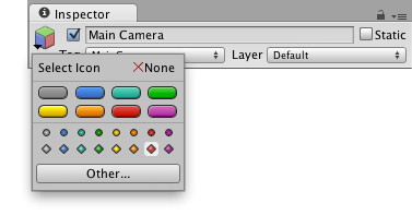
Selecting an icon for a GameObject 为游戏物体选择一个图标。
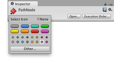
Selecting an icon for a script 为脚本选择一个图标。
Showing and Hiding Icons and Gizmos 显示隐藏图标和Gizmo
With the Gizmos dropdown it is possible to toggle which gizmos and icons should be visible per Component type. As increasingly more gizmos and icons are added in the Scene View a way is needed to filter out the increasing cluttering of gizmos and icons when working on a specific area.
Gizmos下拉菜单可以切换Gizmos和图标在每个组件类型是否可见。随着越来越多的Gzimos和图标添加的场景视图,当工作于一个特定区域,需要筛选出不断增加杂乱的Gzimos和图标。
To show the the current gizmo and icon state click on Gizmos in the control bar of the Scene or Game View. The toggles here are used to set which icons and gizmos are be visible.
显示当前gizmo和图标状态,在场景视图或游戏视图的Gzimos控制条上点击。切换这里用来设置图标和gizmos是否可见。
Note that the scripts that show up in the section Scripts are the scripts that either have a custom icon or have OnDrawGizmos () or OnDrawGizmosSelected () implemented.
注意脚本显示在脚本标签部分,要么有一个自定义图标或OnDrawGizmos () 或 OnDrawGizmosSelected () 。
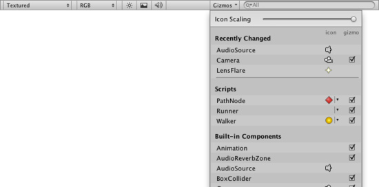
The Gizmos dropdown, displaying the visibility state of icons and gizmos
Gzimos下来菜单,显示图标或gizmos和图标的可见状态。
Component Expanded State 组件展开状态
While icon visibility is controlled exclusively from the Gizmos dropdown, the gizmo visibility state is also tied to whether a Component is expanded in the Inspector or not. They are one and the same - checking or unchecking the checkbox for a gizmo in the Gizmos dropdown will also expand or collapse its corresponding Somponent in the Inspector, and vice versa. So one way to toggle a gizmo is to collapse or expand its corresponding Component in the Inspector. Note that the state exists regardless of whether an Inspector is currently shown or not, and it can always be seen in the Gizmos dropdown.
Gizmo的可视性状态也绑定无论如何一个组件展开在检视面板与否。 -> Gizmo的可见性也和一个组件在检视面板展开与否绑定。 它们是同一个 - 在Gizmos下拉菜单选择或不选择复选框,也将在检视面板展开或塌陷相应的组件,反之亦然。 -> 它们是相同的——在Gizmos下拉菜单选择或不选择Gizmo复选框,也将相应展开或收起它在检视面板的对应组件。 注意,状态不管是否存在,在检视面板是否当前显示或不显示,它总是在Gizmos下拉菜单可见。
Icon Scaling 图标缩放
With the Icon Scaling slider the icon world size can be adjusted. When icons are set to have a world size, they are shown larger the closer they are, up to a maximum screen size. The further the slider is to the right, the bigger the world size is. When it is all the way to the right, all icons have their maximum screen size and when it is all the way to the left all icons are entirely hidden.
替补缩放滑条,图标的世界大小可以被调节。当图标设置有一个世界大小,它们显示较大接近,一个最大屏幕大小。滑条向右拉,尺寸越大。当拉到最右边,所有图标达到他们最大的屏幕大小和滑块到最左边所有图标隐藏。